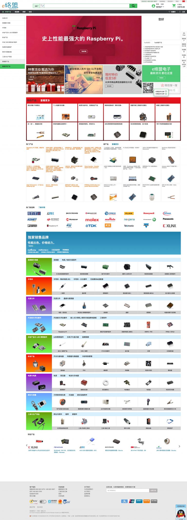
CN Homepage Redesign
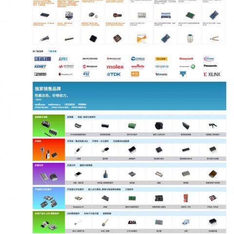
Each countries website follows the same design despite been localised into the local language. The decision was then taken to redesign the China homepage to reflect how different a market China was to everywhere else. Brand guidelines were relaxed to allow for a more colourful eye catching design much more in keeping with the Chinese market where bold colours and lots of content in long scrollable pages are common place. I designed the page to an agreed wireframe using research into Chinese user habits and then built the page as well. The design was initially A/B tested against the standard design where after a couple of months the new design was showing significant uplift in relation to revenue per visit. The decision was then taken to make the homepage redesign available to 100% of visitors and to use to full time.
View Portfolio
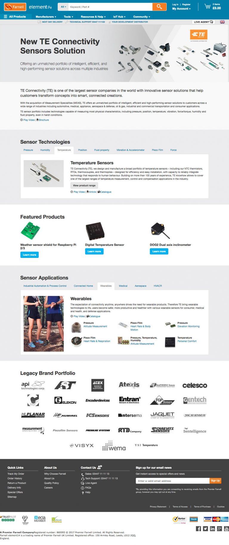
TE Connectivity Sensors
The brief was to build a landing page to promote the suppliers range of sensors. The design was to be modern, clean and promote the technologies that could be utilised with these products. The campaign was promoted with homepage leaderboards, merchandising banners, emails and social media banners. All of which directed extra web traffic to the landing page. The supplier themselves also wanted sign off on the page before the design and build could go live.
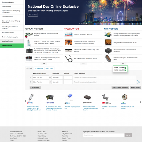
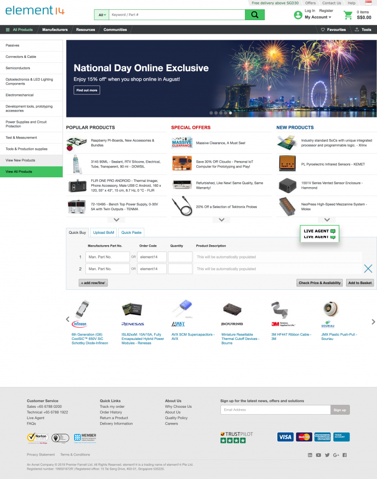
SG MY National Day
A special offer campaign design to coincide with National day in both Singapore and Malaysia. With separate designs and content specific to each locale. The build and design was to run on the theme of a country which is celebrating and that products featured would be available for a cheaper price. The work included homepage leaderboard banners, landing pages and merchandising banners to promote the event.
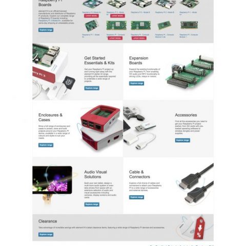

Raspberry Pi Launch
A huge day in which a new product is launched, this creates a surge in website visitors, and purchases often exceed stock levels on the first day. The design needed to look professional but easy to navigate with the key information presented directly to the customer. As when the announcement is made there is a frenzy to get the product before it sells out. The UX/UI for navigating through the customer journey was a big consideration for this project. Also content had to be prepared to be launched in cohesion with the launch announcement. The website build work included leaderboard banners, landing page builds, advertising banners and email campaigns.
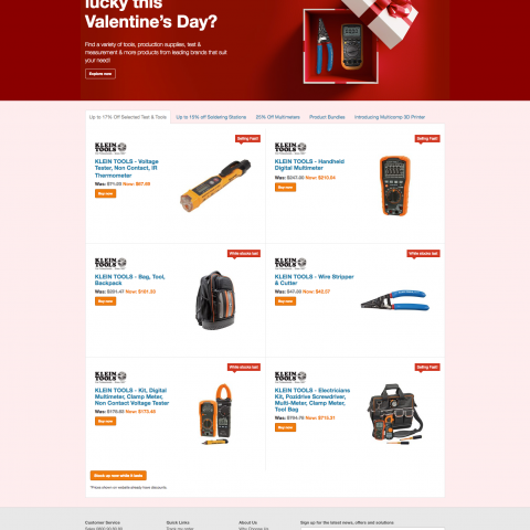
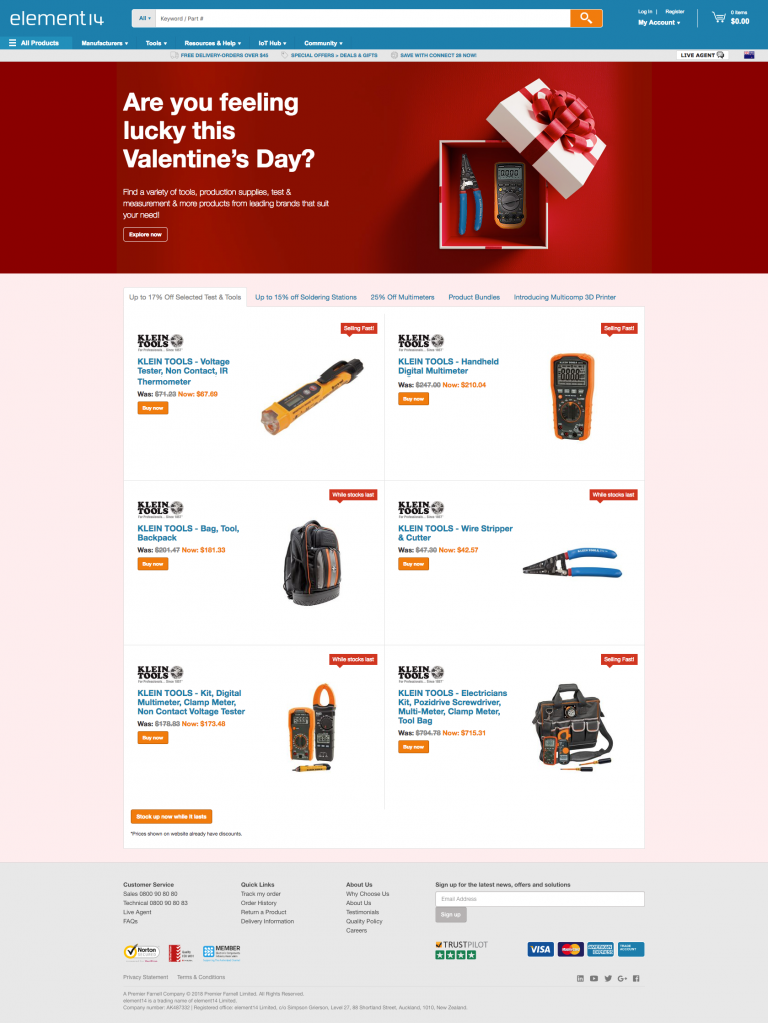
ANZ Category Campaign
A category specific campaign selling goods at a discounted rate, tied in to Valentines day. This campaign was to push up sales and required a landing page built and designed, merchandising collateral around the websites to advertise the campaign as well as email and online ads. The design I chose tied in the valentines theme with an opening of a gift box but containing easily recognisable products from within the category.
Raspberry Pi Day
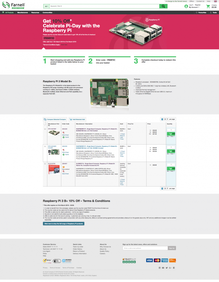
An annual event to celebrate Raspberry Pi, the company mark the event by hosting a special offer on Pi products, the job was to build an attractive design to capture the audience, a homepage banner and supporting landing page to detail the offer. There was also advertising material created to publicise the online offer.
Infineon
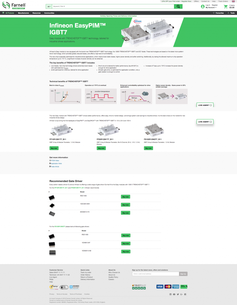
A new product launch required a landing page design and build, merchandising banners, social media and online ad banners. The page build used bootstrap to ensure a responsive viewport suitable for all devices. The contents of the landing page was also used to support an email campaign to selected customers.
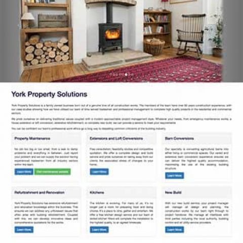
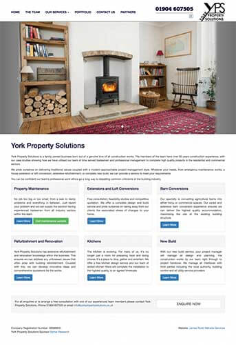
York Property Solutions
York Property Solutions were a new business that almost took up the business starter package offer, however after sitting down with the client and discussing their specific needs we determined they needed some additional development work as a way of best showcasing the work they do. This epitomises the approach I take to website development, getting to understand the client’s exact needs before coming up with the proposed solution that can address them most appropriately.
View Portfolio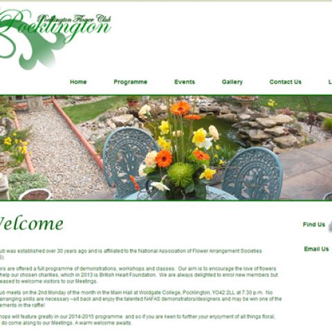
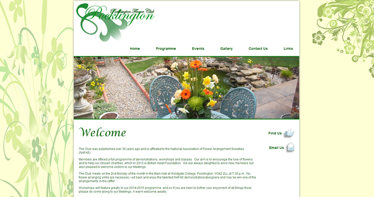
Pocklington Flower Club
Pocklington Flower Club are the first example of a client requiring a very bespoke build. They wanted a website that they can update the front end text themselves whilst also managing the clubs events and activities. This specific need required a MySQl database to store the events and a combination of PHP to deliver this information dynamically to the page. This was then incorporated in to a Content Management System (CMS) so the flower club members could update the information without requiring technical website development skills.
View Portfolio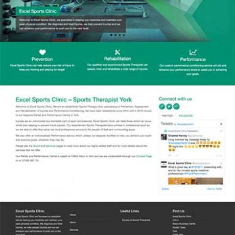
Excel Sports Clinic
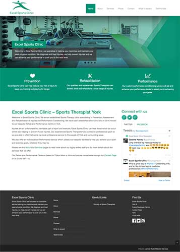
Excel Sports Clinic took advantage of our generous starter package deal, they were a new business starting up in a competitive market. It was important they had a presence on the web, along with email so the business could get up and running. An SEO campaign was also undertaken to drive business to the company. The emphasis on the design was to be clean, clear and to give off a friendly welcoming impression that reflects the clients approach.
View Portfolio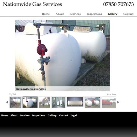
Nationwide Gas Services
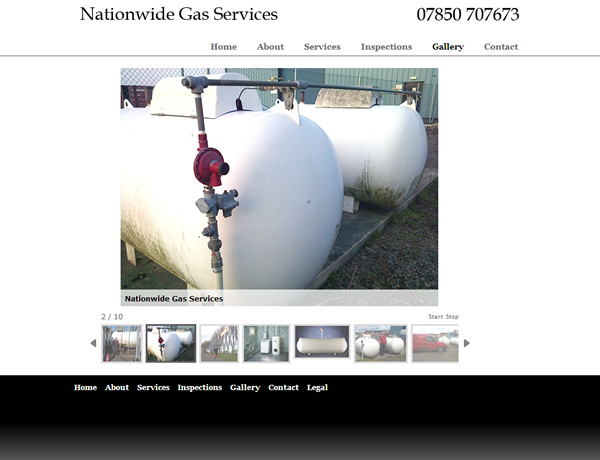
Another business to take advantage of our business starter package was Nationwide Gas Services. They were an already established business but wanted a prescence on the internet so their already wide client base could find them and contact them easily. The client felt that yellow pages was a thing of the past and people now use search engines when searching for services they require. The website was built to be easy to use, provide a point of contact and advise on the services the business offers.
View Portfolio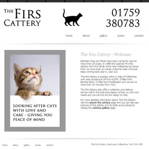
Firs Cattery
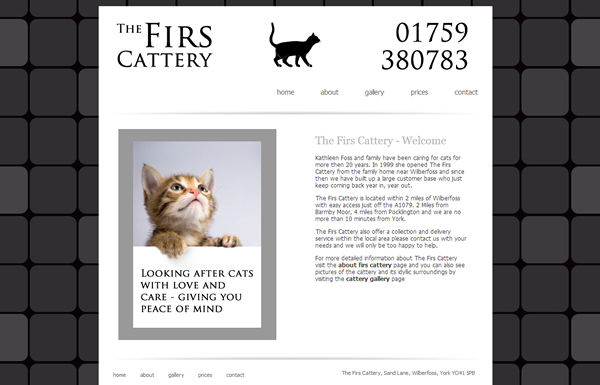
The Firs Cattery website was done for the local business to help them promote themselves in the area. The emphasis was on a simple good looking design that made it easy for users to see the information they wanted, as well as the gallery which had importance for displaying clearly where the cats would be staying. Part of this project also included setting up email account where forms filled in on the website will be directed too and an SEO campaign to make sure it could be found in search engines for pre agreed search terms.
Monday At Nine
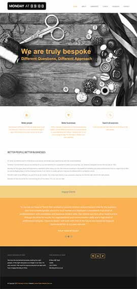
Monday at Nine is a fully responsive website built with the latest bootstrap framework and integrated into WordPress CMS. The website was for a starter company that looks set to flourish in the recruitment industry. The website is certain to be one that will grow and grow with the business.
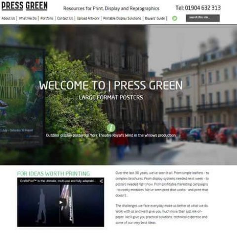
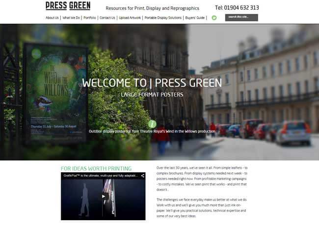
Press Green
Press Green are a design and print company based in York. With their background they had an input on the design of the website and we worked together to come up with something they were happy with. The website is clean and easy to read with a high visual content to demonstrate their work. The website build includes a CMS so they are able to edit their content on the website as well.
